Components List
Complete API reference for all WDK React Native UI Kit components
Component List
| Component | Description |
|---|---|
AmountInput | Numeric input with token/fiat toggle, balance helper and Max action |
AssetSelector | Token search & pick list with recent items and empty states |
NetworkSelector | Network picker with gas level indicators and colors |
Balance | Displays a balance value with optional masking and custom loader |
CryptoAddressInput | Address input with QR scan and paste helpers, validation state |
QRCode | QR renderer for addresses/payment requests with labeling and styling |
TransactionItem | Single transaction row (sent/received) with token, amounts, network |
TransactionList | Virtualized list of transactions using TransactionItem |
SeedPhrase | Grid of seed words with optional editing and loading states |
AmountInput
Numeric input component with token/fiat toggle, balance display, and Max functionality.
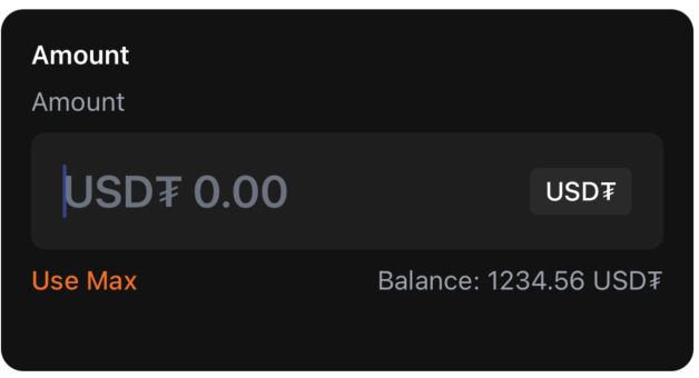
Props
| Prop | Type | Required | Default | Description |
|---|---|---|---|---|
label | string | No | 'Enter Amount' | Field label |
value | string | Yes | — | Amount text value |
onChangeText | (text: string) => void | Yes | — | Called when text changes |
tokenSymbol | string | Yes | — | Token code, e.g. 'ETH', 'BTC' |
tokenBalance | string | Yes | — | Token balance (e.g. '1.23') |
tokenBalanceUSD | string | Yes | — | Balance in fiat (e.g. '$4200.00') |
inputMode | 'token' | 'fiat' | Yes | — | Current input mode |
onToggleInputMode | () => void | Yes | — | Switch between token/fiat modes |
onUseMax | () => void | Yes | — | Fill with maximum available amount |
error | string | No | — | Error message to display |
editable | boolean | No | true | Whether input is editable |
Example
import { AmountInput } from '@tetherto/wdk-uikit-react-native'
function SendAmount({ amount, balance, onAmountChange }) {
return (
<AmountInput
label="Enter Amount"
tokenSymbol="ETH"
value={amount}
onChangeText={onAmountChange}
tokenBalance={balance.toString()}
tokenBalanceUSD="$2,500.00"
inputMode="token"
onToggleInputMode={() => {/* Switch mode */}}
onUseMax={() => onAmountChange(balance.toString())}
/>
)
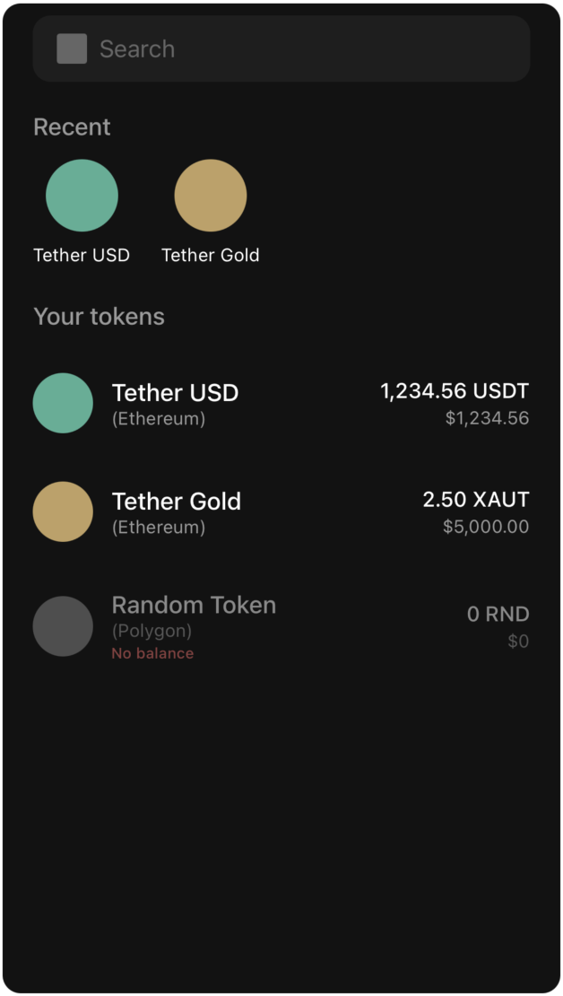
}AssetSelector
Token selection component with search functionality and recent tokens.
Props
| Prop | Type | Required | Default | Description |
|---|---|---|---|---|
tokens | Token[] | Yes | — | Full list of tokens to display/filter |
recentTokens | string[] | Yes | — | Array of recent token names for Recent row |
onSelectToken | (token: Token) => void | Yes | — | Called when user selects a token |
Token Type
type Token = {
  id: string
  symbol: string
  name: string
  balance: string
  balanceUSD: string
  icon: ImageSourcePropType
  color: string
  network?: string
  hasBalance: boolean
}
Example
import { AssetSelector } from '@tetherto/wdk-uikit-react-native'

function TokenPicker({ tokens, recentTokens, onTokenSelect }) {
  return (
    <AssetSelector
      tokens={tokens}
      recentTokens={recentTokens}
      onSelectToken={onTokenSelect}
    />
  )
}
Balance
Display component for showing balance values with optional masking and loading states.
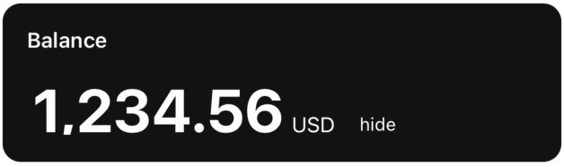

Props
| Prop | Type | Required | Default | Description |
|---|---|---|---|---|
value | number | No | 0 | Balance number value |
isLoading | boolean | No | false | Show loading state |
Loader | React.ComponentType | No | — | Custom loader component |
showHide | boolean | No | true | Toggle hide/show balance functionality |
currency | string | No | 'USD' | Currency label |
EyeOpenIcon | React.ComponentType | No | default | Icon shown when balance is hidden |
EyeClosedIcon | React.ComponentType | No | default | Icon shown when balance is visible |
Example
import { Balance } from '@tetherto/wdk-uikit-react-native'

function WalletBalance({ balance, currency, isLoading }) {
  return (
    <Balance
      value={balance}
      currency={currency}
      isLoading={isLoading}
      showHide={true}
    />
  )
}
CryptoAddressInput
Address input component with QR scanning and paste functionality.

Props
| Prop | Type | Required | Default | Description |
|---|---|---|---|---|
label | string | No | 'Recipient Address' | Field label |
value | string | Yes | — | Address text value |
onChangeText | (text: string) => void | Yes | — | Called when text changes |
placeholder | string | No | 'T08p3BGPIuh1l934IIflu....Kc2GXhKc' | Placeholder text |
onPaste | () => void | No | — | Paste action handler |
onQRScan | () => void | No | — | Open QR scanner handler |
editable | boolean | No | true | Whether input is editable |
error | string | No | — | Error message to display |
Example
import { CryptoAddressInput } from '@tetherto/wdk-uikit-react-native'

function AddressInput({ address, onAddressChange, onQRScan }) {
  return (
    <CryptoAddressInput
      label="Recipient Address"
      value={address}
      onChangeText={onAddressChange}
      onQRScan={onQRScan}
      placeholder="Enter wallet address..."
      error={addressError}
    />
  )
}
QRCode
QR code renderer for addresses and payment requests.
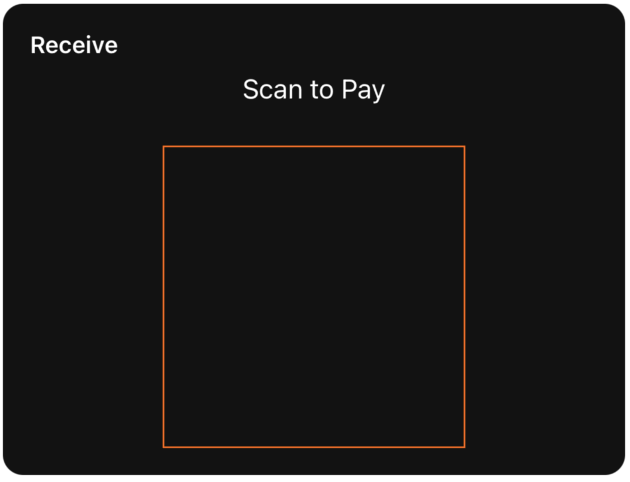
Props
| Prop | Type | Required | Default | Description |
|---|---|---|---|---|
value | string | Yes | — | Data to encode in QR code |
size | number | No | 200 | QR code side length in pixels |
color | string | No | theme.primary | Dot color |
backgroundColor | string | No | 'transparent' | Background color behind QR code |
label | string | No | — | Optional title above QR code |
containerStyle | ViewStyle | No | — | Wrapper style |
labelStyle | any | No | — | Style for label text |
Example
import { QRCode } from '@tetherto/wdk-uikit-react-native'

function AddressQR({ address }) {
  return (
    <QRCode
      value={address}
      size={250}
      label="Scan to receive"
      color="#000000"
      backgroundColor="#FFFFFF"
    />
  )
}
TransactionItem
Single transaction row component for displaying transaction details.
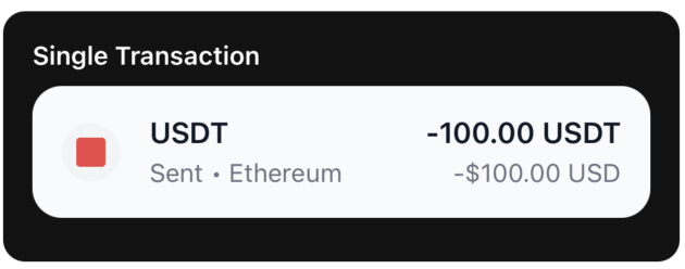
Props
| Prop | Type | Required | Default | Description |
|---|---|---|---|---|
transaction | Transaction | Yes | — | Transaction data object |
onPress | () => void | No | — | Row press handler |
Transaction Type
type Transaction = {
  id: string
  token: string
  amount: string
  fiatAmount: string
  fiatCurrency: string
  network: string
  type: 'sent' | 'received'
}
Example
import { TransactionItem } from '@tetherto/wdk-uikit-react-native'

function TransactionRow({ transaction, onPress }) {
  return (
    <TransactionItem
      transaction={transaction}
      onPress={onPress}
    />
  )
}
TransactionList
Virtualized list component for displaying multiple transactions.
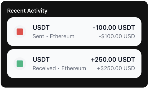
Props
| Prop | Type | Required | Default | Description |
|---|---|---|---|---|
transactions | Transaction[] | Yes | — | Array of transaction objects |
Example
import { TransactionList } from '@tetherto/wdk-uikit-react-native'

function TransactionHistory({ transactions }) {
  return (
    <TransactionList
      transactions={transactions}
    />
  )
}
NetworkSelector
Network selection component with gas level indicators.
Props
| Prop | Type | Required | Default | Description |
|---|---|---|---|---|
networks | Network[] | Yes | — | Array of available networks |
onSelectNetwork | (network: Network) => void | Yes | — | Called when network is selected |
Network Type
type Network = {
  id: string
  name: string
  gasLevel: 'High' | 'Normal' | 'Low'
  gasColor: string
  icon: string | any
  color: string
}
Example
import { NetworkSelector } from '@tetherto/wdk-uikit-react-native'

function NetworkPicker({ networks, onNetworkSelect }) {
  return (
    <NetworkSelector
      networks={networks}
      onSelectNetwork={onNetworkSelect}
    />
  )
}
SeedPhrase
Grid component for displaying and editing seed phrase words.
Props
| Prop | Type | Required | Default | Description |
|---|---|---|---|---|
words | string[] | Yes | — | Array of seed words (12/24, etc.) |
editable | boolean | No | false | Allow editing of word inputs |
onWordChange | (index: number, word: string) => void | No | — | Called when word is edited |
onKeyPress | (index: number, key: string) => void | No | — | Handle key press events |
isLoading | boolean | No | false | Show loading/generating state |
Example
import { SeedPhrase } from '@tetherto/wdk-uikit-react-native'

function WalletBackup({ seedWords, editable, onWordChange }) {
  return (
    <SeedPhrase
      words={seedWords}
      editable={editable}
      onWordChange={onWordChange}
      isLoading={false}
    />
  )
}
Next Steps
- Get Started - Quick start guide and basic usage
- Theming Guide - Deep dive into theming capabilities
- React Native Quickstart - Complete implementation example